Ronin Strength’s Identity.
My friend, and amazing strength coach John Amore asked for help creating an identity in a very crowed space.
Here’s how we went about differentiating his practice from other trainers with a similar name.
Begin at the beginning
The first step in the identity process is the same, no matter the scale. You start by identifying influences, needs, and competitors.
With Ronin Strength, we knew that there were others in the health and wellness space using a similar name so the need was straightforward. Create a memorable, easily repeatable, icon that didn’t look like everyone else.
Everyone loves Oni til it’s time to do Oni shit.
Same with samurai…
Shodo, Sumi-e & Ensō. We let the brain flow.
Oh… self identification STAMPS. interesting.
Ok now we’ve got lots of cool and interesting influence. Let see what other people are doing in the space.
Like it says above. LOTS of clip art of dudes with swords, “Asian” fonts, kanji, helmets, some hanko but nothing cohesive… Lets see what we can come up with that avoids most of this.
I say most of this because, come on it’s REAL tough to avoid Red and Black.
We came up with the above recommendations, to keep their typography consistent no matter who or where they’re working on stuff.
And leaned hard into the Hanko name stamp execution.
True joy is to take pleasure in one's own accomplishments....
-Kazuo Koike
We went through a few rounds of revisions taking the forms and intent of Shodo brushwork, but in a contemporary execution. We settled on the big version of a stylized R below.
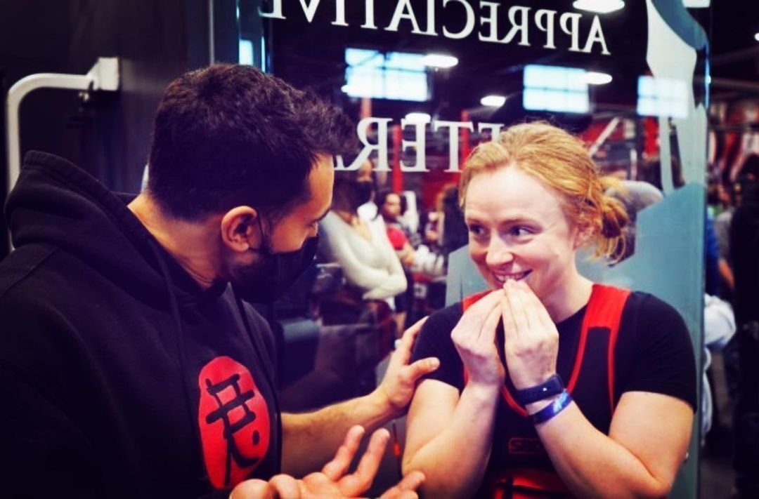
Here’s some examples of how everything comes together for social posts and merch.
In the real world. It’s important to wear the right gear when you do heavy shit.